Introduction
Led a comprehensive redesign of Port’s web platform, covering UI design, user flows, and information architecture to improve overall usability and system coherence.
Product
Team
PM*1
UIUX*1
MKT*1
Engr.*2
Product
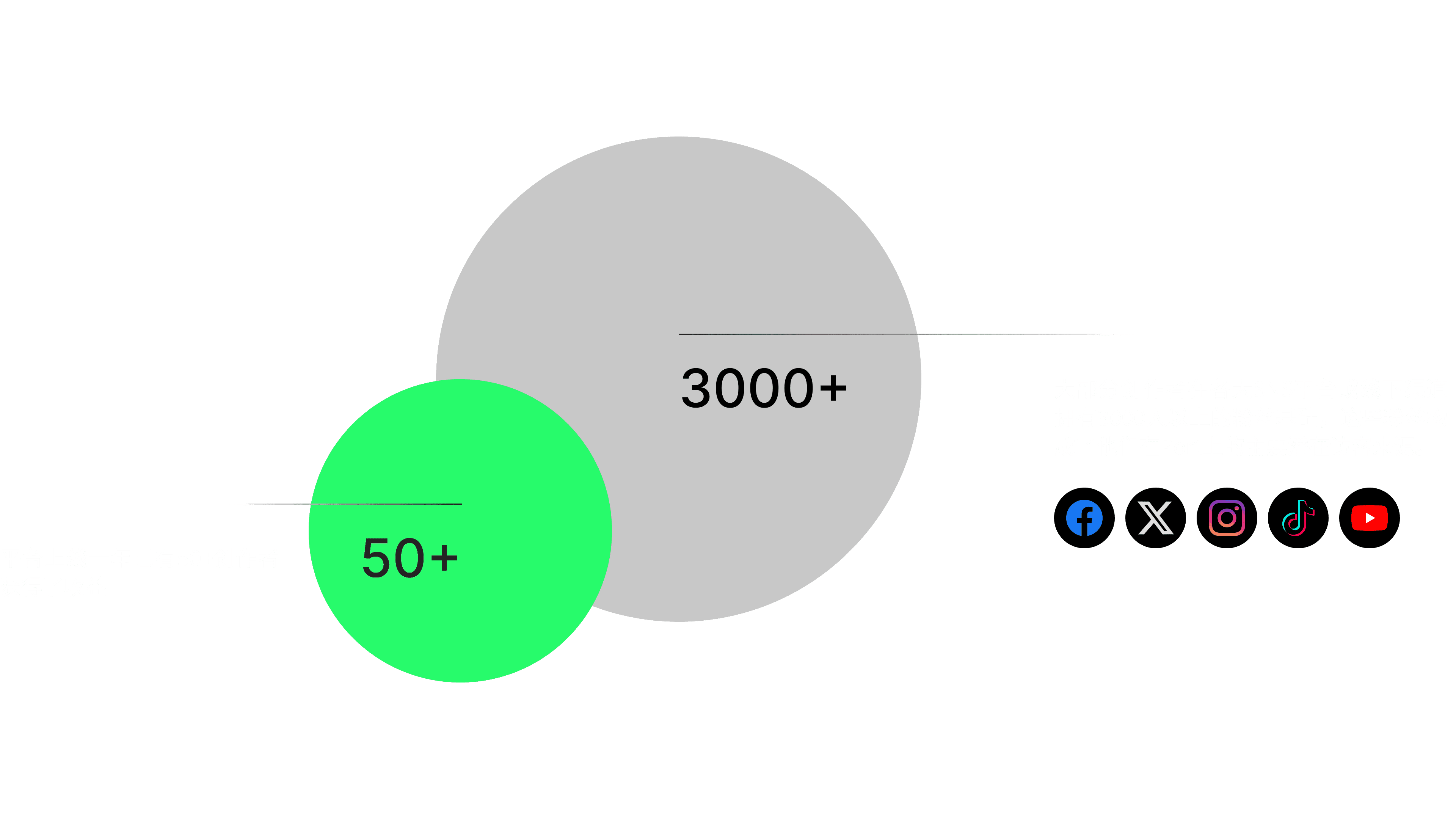
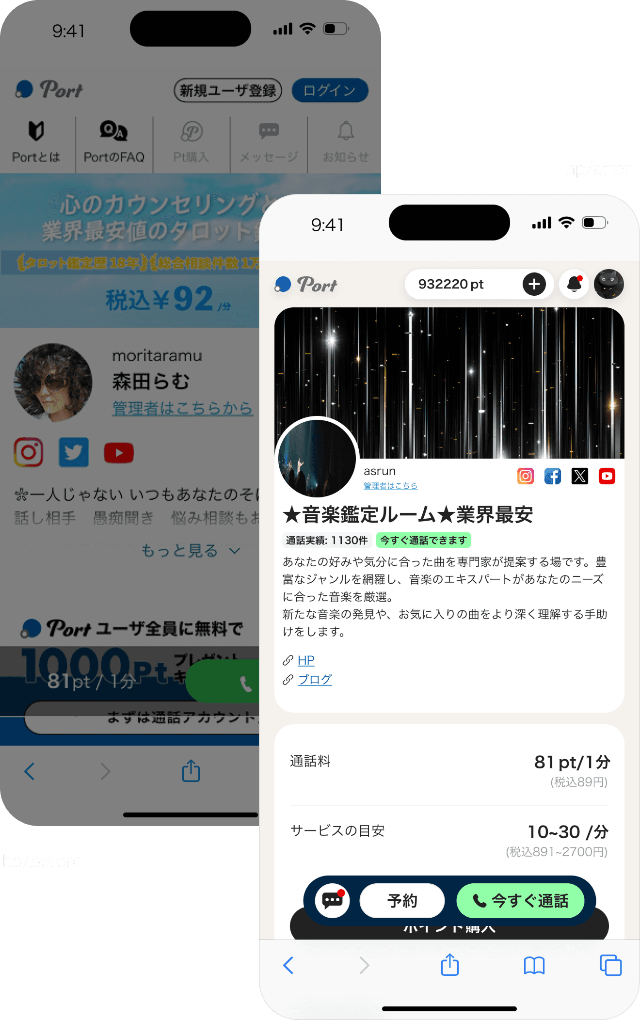
Port is a web-based audio and video consultation platform connecting creators (B-side) with their followers (C-side) through one-on-one paid sessions.
Creators can set up personalized profile pages to showcase their services and monetize through real-time consultations. Many users are driven to the platform via creators’ social media channels, seeking more private, personalized, and emotionally engaging consultation experiences.
Challenge
We led a systematic experience redesign of Port, rethinking its overall interface logic, information architecture, trust-building touchpoints, and key conversion flows.
The goal was to improve conversion rates of consultation, strengthen the platform’s long-term growth potential, and create a more natural and seamless service loop between creators and users.

data before redesign
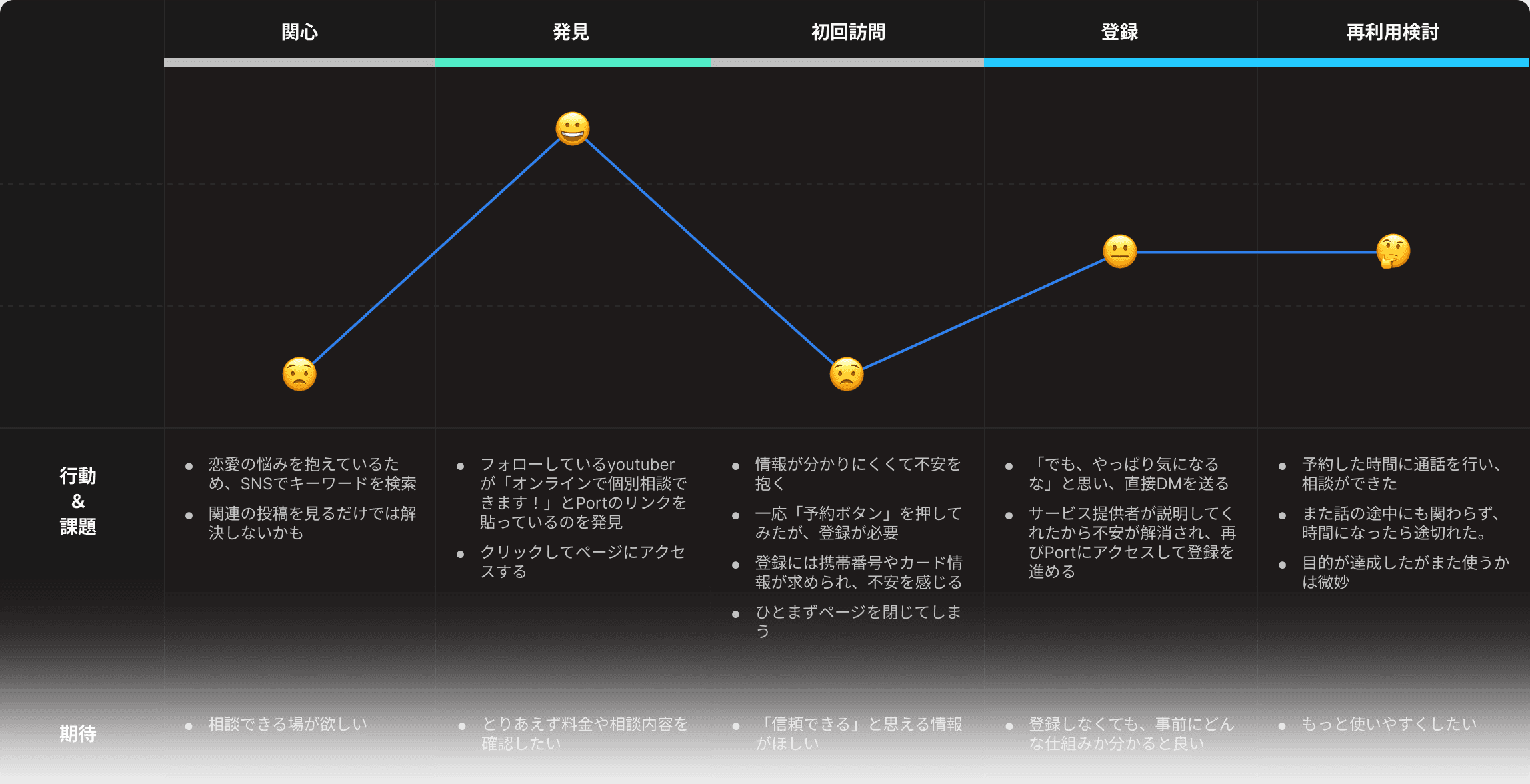
journey map from interview
Solution / hp
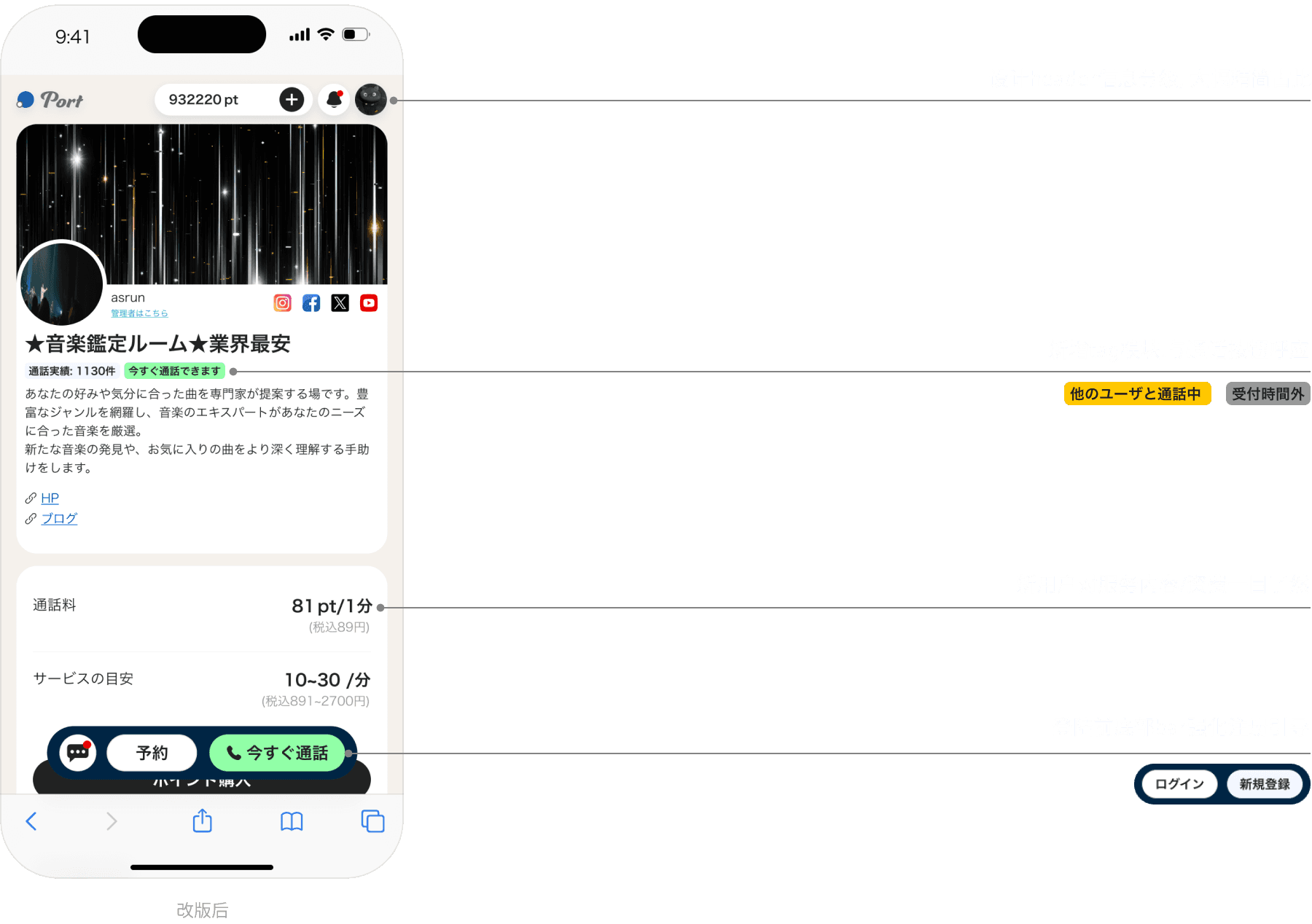
We restructured the information hierarchy of creator profile pages, significantly improving information clarity and user efficiency.
Key details became immediately accessible at a glance, resulting in an 8% increase in call conversion rates.
Before the redesign, the homepage suffered from a fragmented information hierarchy, becoming a key drop-off point during critical decision moments.
After the redesign, user trust in the platform improved significantly, through creator interviews.
before
Imbalanced Information Structure
Platform-level messaging and user-specific features were mixed together, leading to a lack of clear separation.
Elements such as “points” and “messages” were displayed even for non-logged-in users, creating confusion around user status, permissions, and overall platform positioning.
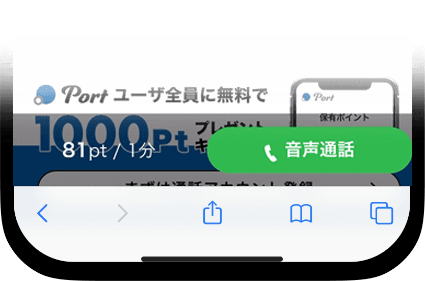
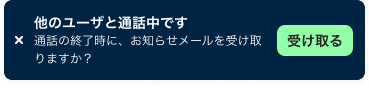
Lack of Clarity and Trust in CTA btn
The persistent call button at the bottom lacked clear messaging, leaving users uncertain about what would happen after clicking.
This ambiguity reduced users’ sense of security, ultimately discouraging them from taking action.
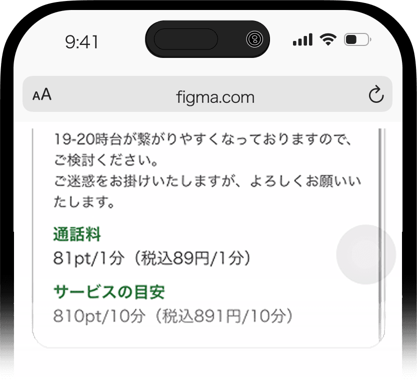
Key Information Buried
Critical details such as pricing were embedded within dense text and lacked visual prominence.
As a result, users struggled to quickly perceive the value, leading to weakened decision confidence.
after

Design Token
字体
Hiragino Kaku Gothic Pro
Aa
Netural
Primary
Others


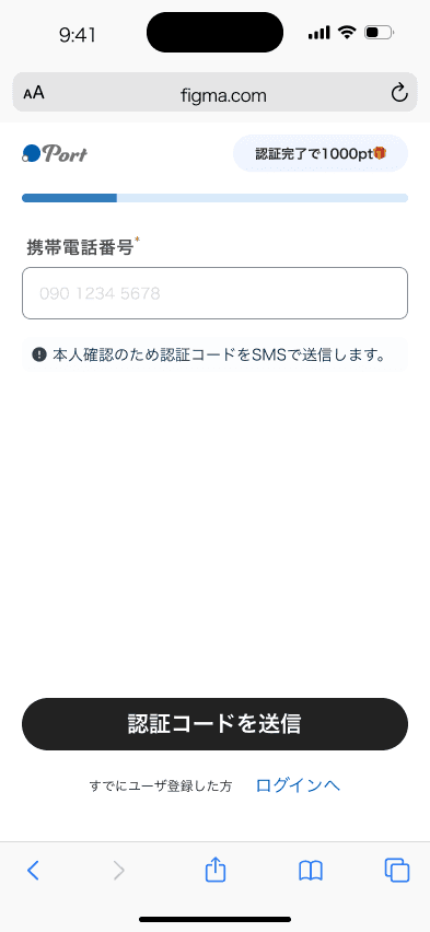
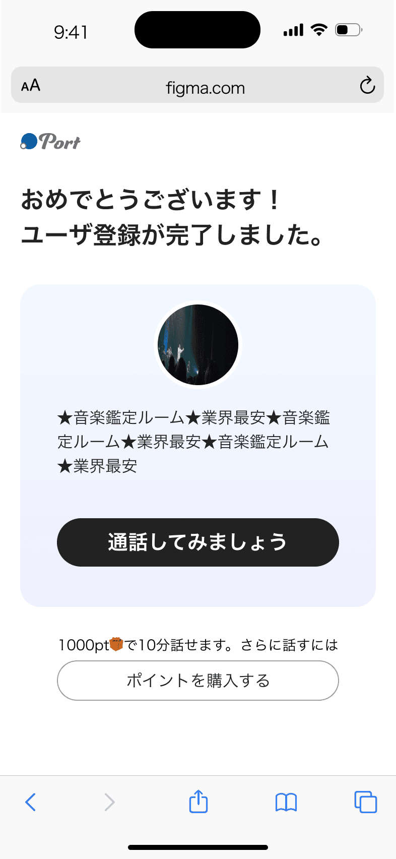
Solution / Registration pages
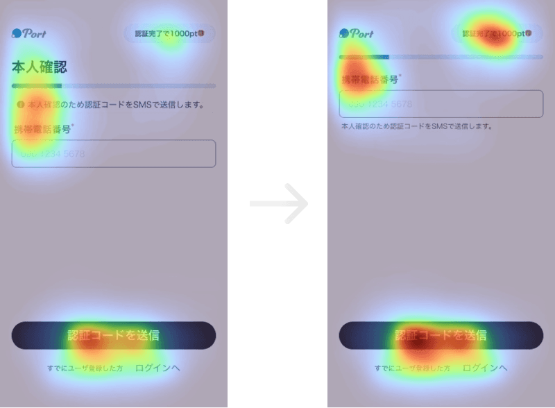
Using gaze heatmaps and behavioral analysis, we reduced the input burden on the registration flow by 70%.
We also designed tailored onboarding paths based on the distinct needs of users and creators, resulting in a 200% increase in registration completion rate after launch.
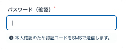
Before the redesign, users were required to complete 10+ input fields—including phone, email, and payment details—within a single page during registration.
This created friction and led to feelings of fatigue and uncertainty, discouraging users from completing the process.
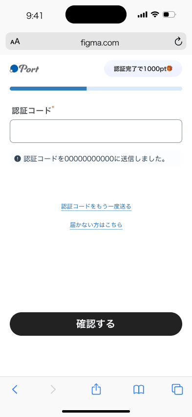
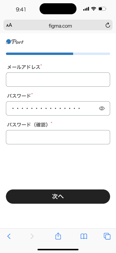
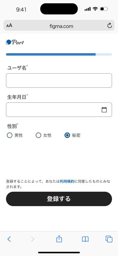
After the first version, we leveraged attention heatmap analysis and found that an overload of elements was diluting user focus on key actions.
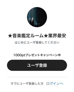
We streamlined the interface by simplifying the layout, removing the header, and de-emphasizing supporting descriptions. This allowed user attention to concentrate on the three most critical elements—the input field, the “1000 points reward” message, and the registration CTA btn.
After
In the initial registration flow, users were redirected directly to the homepage after signing up. However, for first-time users, this transition lacked guidance and often led to uncertainty around “what to do next.”
This issue was further amplified by the platform’s dual roles—creators and general users—whose post-registration needs differ significantly. A single, unified redirect path failed to support their distinct onboarding journeys.
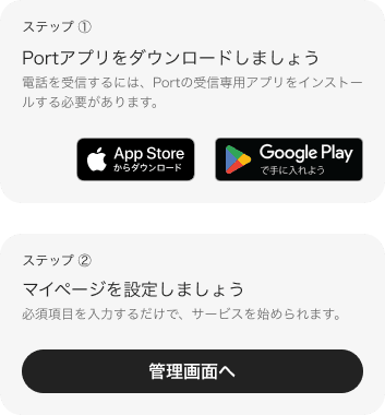
To address this, I designed a dedicated post-registration onboarding screen, providing clear next-step guidance tailored to each user role, enabling a smoother transition into the service experience.
Creators

General users
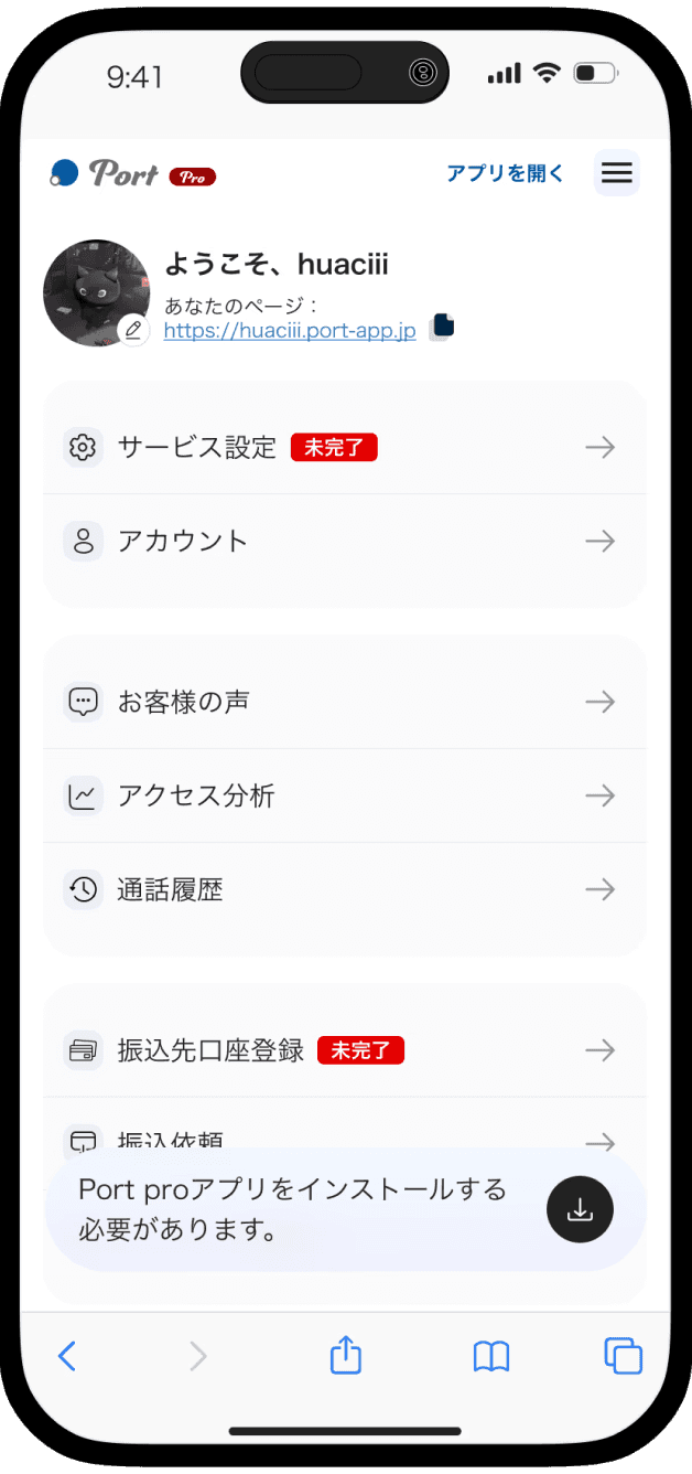
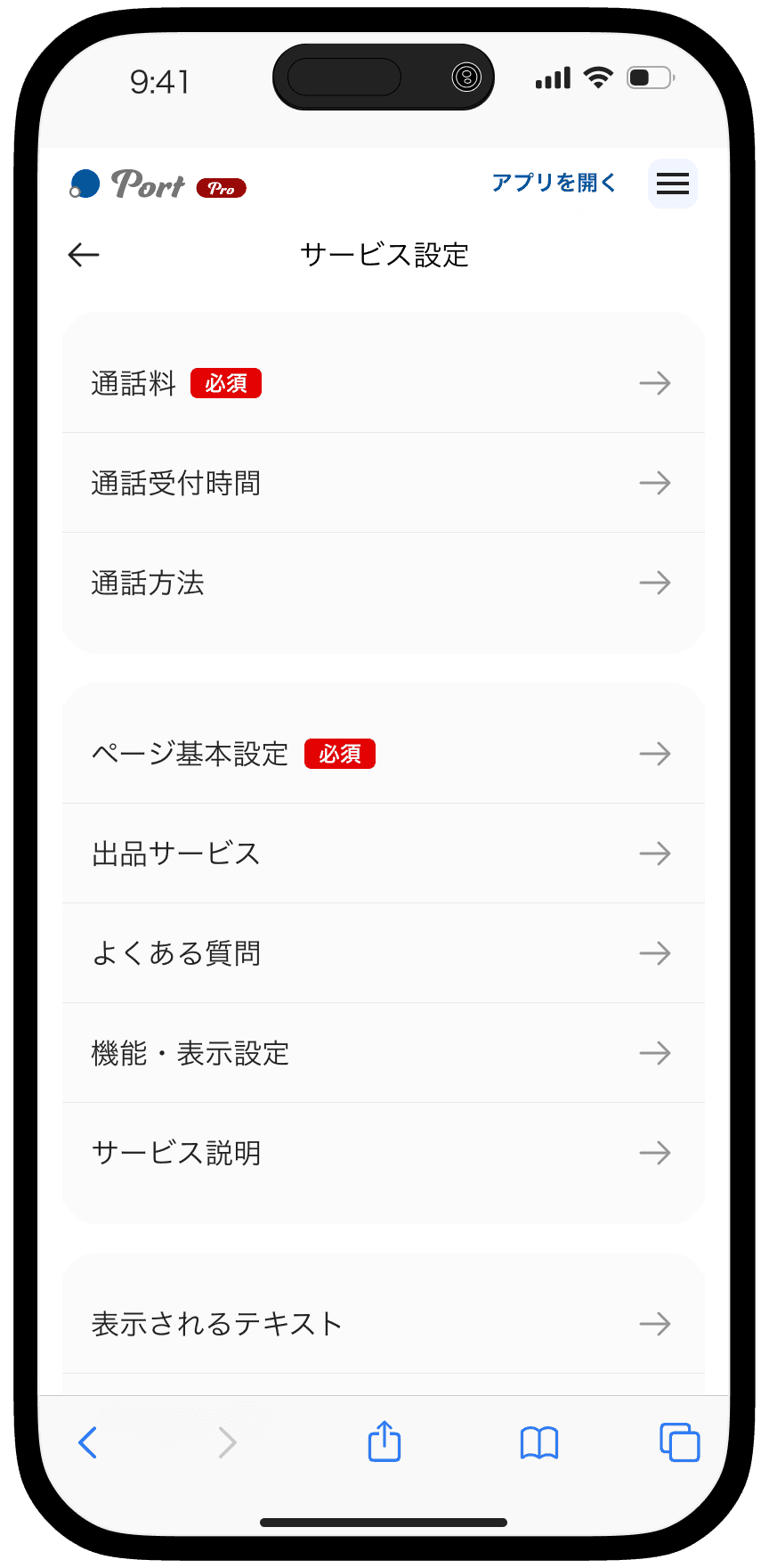
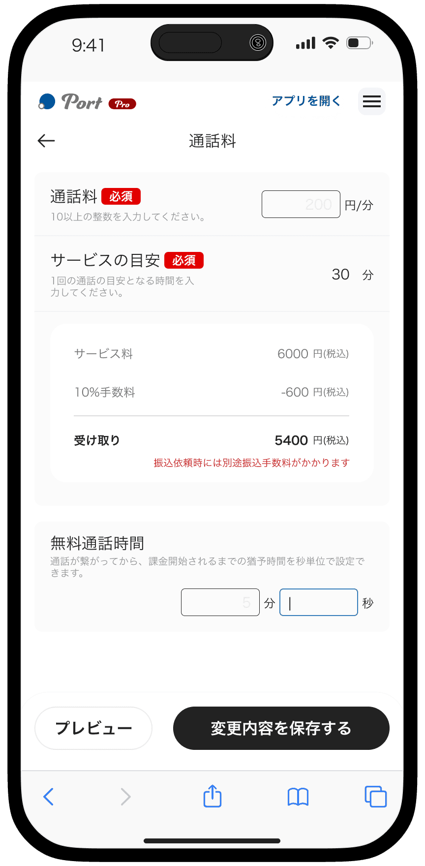
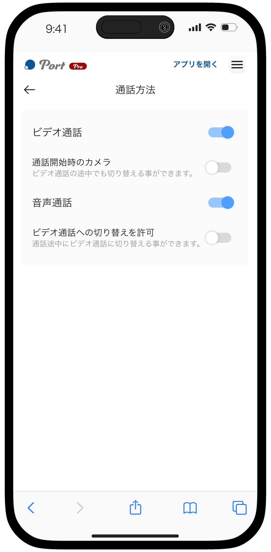
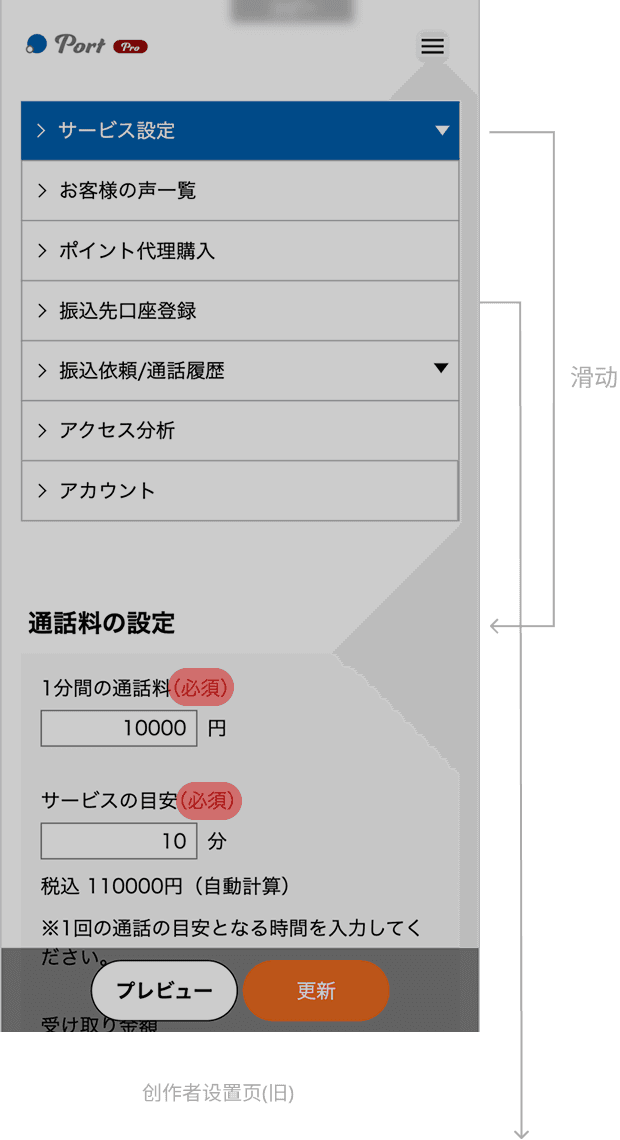
Solution / Settings for creators
We restructured the logic and information architecture of the creator settings page, bringing key configurations to the forefront so creators can immediately understand the steps required upon entry.
Through improvements in structure and hierarchy, the completion rate of critical settings increased by 11%, enabling creators to prepare their services more efficiently and begin offering consultations with greater ease.
In the original creator settings flow, users had to navigate across multiple pages and scroll extensively to locate specific settings, resulting in a fragmented experience. Critical configurations required to start offering services were buried within secondary menus, making it difficult for first-time creators to identify priorities.
After the redesign, we introduced a tab-based navigation structure and grouped settings by functional categories, allowing creators to quickly locate and adjust relevant items. Essential setup tasks were elevated to the primary view, making them immediately visible upon entry. This reduced the effort required to search and confirm settings, while providing clearer guidance for first-time use.
Before
Vertical Navigation Causing Excessive Interaction Depth
Critical Setup Tasks Hidden in Secondary Menus
After