Introduction
Built Pompon’s MVP from 0 to 1, including user research, flow design, and UI/UX.
产品
SaaS
Admin/B/C
团队
PM*1
UIUX*1
工程师*2
Promblem
In architectural projects, design firms need to maintain continuous communication with construction sites to ensure that design plans are accurately executed.
However, sites are often distributed across different locations, making it difficult for firm members to stay on-site. As a result, they rely on phone calls, messaging, or periodic visits to track progress.
As the number of projects increases, this approach reveals clear inefficiencies—especially when managing multiple sites simultaneously, where the cost of information access and communication rises significantly.
This project aims to design a remote monitoring system from 0 to 1, enabling firms to manage multiple construction sites more efficiently.
Understanding
Architecture firm users need to frequently access information and coordinate across multiple construction sites, yet existing workflows rely heavily on phone calls and on-site visits, resulting in low efficiency.
Reducing the cost of information access and improving efficiency when switching between multiple projects became the core design focus of this project.
In a typical project team, while roles carry different responsibilities, most tasks—aside from core design work—revolve around a central activity: communicating with and verifying conditions on-site.
Research showed that a single employee is usually responsible for 3–6 construction projects simultaneously, performing an average of 6–14 site-related check-ins per day. Approximately 40–50% of their time is spent on communication and information gathering related to construction sites.
Within this workflow, user behavior follows a clear cyclical pattern: accessing site information, assessing potential issues, communicating with the site, and then re-verifying after each interaction.
As this was my first project in the architecture and construction domain, I spent significant time upfront understanding user workflows and business context, which became a critical foundation for subsequent design decisions.

A snapshot of daily routines

Average communication intensity
Goal
Help architecture firm users manage multiple construction sites more efficiently, while reducing the cost of information access and communication.
Help architecture firm users manage multiple construction sites more efficiently, while reducing the cost of information access and communication.
Through analysis of users and workflows, several key issues were identified:
High cost of accessing on-site information
Delays in information updates
High communication cost
Complexity in managing multiple projects
These challenges point to a core need:
A more efficient way for firms to view and manage construction sites.
Based on these insights, we abstracted each department within the firm as a “Room.” Each Room can monitor multiple construction sites managed by that department.

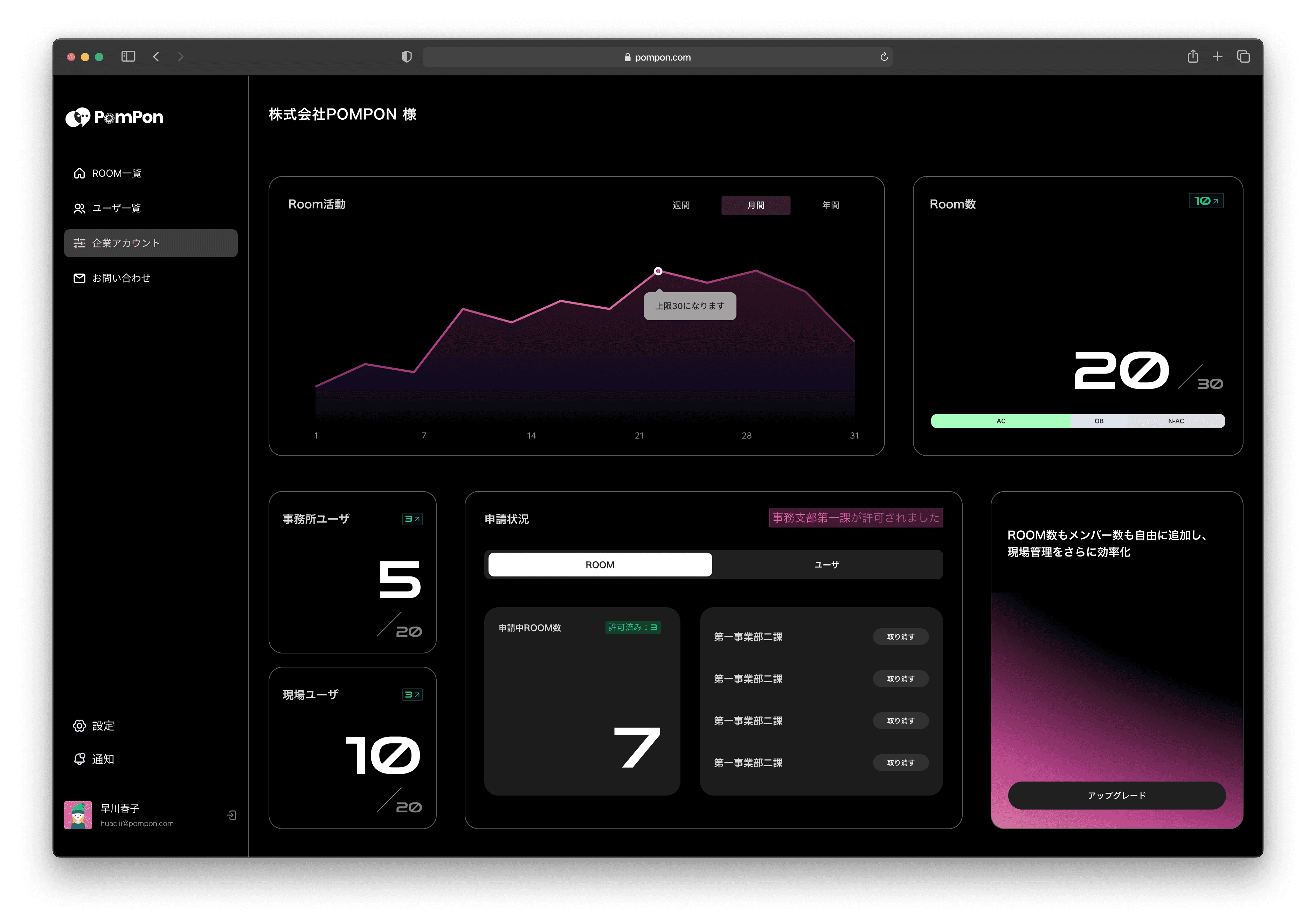
Task / Main Page
In designing the Room overview on the homepage, I focused heavily on information hierarchy.
Since users need to access construction sites frequently, the key question became: what information should be displayed to support quick decision-making and fast access to the appropriate Room?
In the Room overview design, I considered not only resource usage but also the different needs of each user role.
While frontline users mainly prioritize “quick access to Rooms,” managers are more concerned with overall operational status and resource allocation.
Therefore, in this interface, I focused on surfacing system usage status and abnormal activity alongside core Room information, helping users quickly understand the current situation and make informed decisions.

Research


Task / Monitoring Page
Based on users’ monitoring-focused behavior, I focused the design on reducing visual distractions and keeping the monitoring view itself as the primary focus. From an interaction perspective, I minimized persistently visible interface elements and only provided controls and feedback when needed.

For architecture firm users, the primary task after entering a Room is not interaction, but just monitoring. However, both the user list and monitoring windows contain a large amount of interactive content. Displaying all information and controls simultaneously would make the interface overly dense and distract users from the monitoring view itself.
At the same time, users often need to monitor multiple construction sites simultaneously — up to eight views at once in actual usage scenarios — which places even higher demands on the interface layout and information structure.
Therefore, the core challenge of this design was finding the right balance between information visibility and visual focus within a limited screen space.
Other Screens
After completing the core flows and main interfaces, I continued refining and designing the remaining pages of the system.
The main focus of this phase was improving overall consistency across the product and strengthening the connections between different features and functions.
Throughout the design process, I followed the principle of “different entry points, shared logic.” The goal was to help users complete tasks through a consistent structure and interaction pattern.
I also clarified the roles of each module and the flow of information between them. This helped keep the system clear and manageable as new features were added.
Rather than focusing on complex individual features, this part of the design focused more on creating a smooth and connected overall experience. Users could move between different pages naturally while continuing to rely on familiar interaction patterns.
/Userlist

/Account